Nine Examples of Great Logo Designs
Designing a logo, or having one designed for you can be a mammoth task. A logo brands a business or product and is often the first thing a potential client sees. What your business stands for and what your logo says about your business have to be on the same page. When approaching logo design, careful thought and preparation are needed to convey your message with maximum impact.
The design possibilities are endless and sometimes getting started and making decisions can be a mind-boggling and overwhelming task. Do you use a picture or a graphic? What font works with your product while being easy to read? What colours will you use, if any? What basic shape will the logo take on?
To help give you some inspiration and ideas, I’ve compiled a list of some of my favourite logos. Whether they are eye-catching, beautiful or just effective marketing, each logo I’ve chosen stood out from the rest, a very important component of any logo.
The following all have their own reasons for being great logos, so have a look and see if they can give you some ideas and direction for the design of your own logo.

This logo design is sensational! Simple is an overstatement..or understatement, I’m not sure.
The design combines elements of the business name perfectly. With the melding of basic icons, the designer has created their own icon. To cap off the simplistic brilliance, the use of a single colour and a block image shows you don’t need fancy frilly work to make an impact.
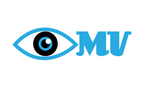
This is a perfect example of a simple, eye catching and very effective logo.
The company is a contact lens manufacturer so the use of an eye tells, without the use of any words, what field the business is in – remember, a picture tells a thousand words. Bright, eye-catching colour means you are more likely to remember this logo and notice it at a glance. This is very handy when trawling through catalogues, which means this company is less likely to be overlooked when their busy clients are re-ordering stock.
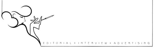
I just love this great logo design, a simple line drawing with no use of colour.
The best feature of this logo is that it meshes perfectly in whatever format it is used whether it be curled into the corner of a business card, featured on the side of letterhead or at the bottom of a newsletter.
A Great Logo Design: Classy, Simple and Sophisticated.
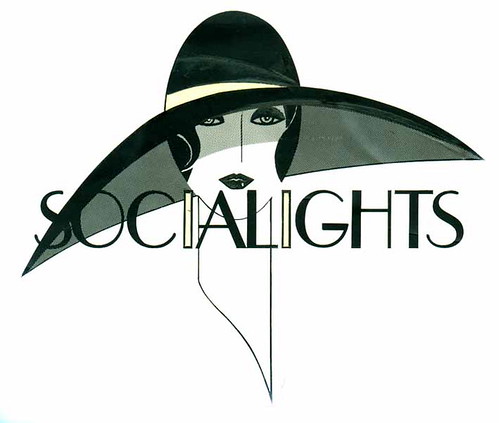
Of course I love anything Art Deco and this great logo is no exception.
Dripping with class and elegance, this is the perfect logo for a distinguished business.
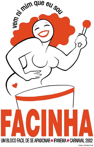
This logo for a Brazilian Carnaval group is classic Brazilian.
Exuding feelings of fun and frivolity this is the perfect design for what it is presenting. Simple line work and use of one colour accentuate the design.

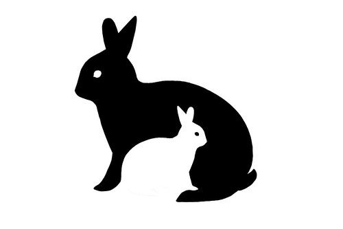
Hailing to shadow box art, this great logo design is striking in its colour contrast and simple idea. Although not an original concept, silhouettes are a very effective and not widely used technique in logo design that carries a big bang for its buck.
Especially useful for a brand that doesn’t want to show off but wants to be noticed.
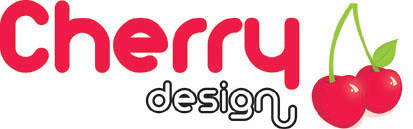
What better way to emphasize your business name than with a picture of the said name? Nothing solidifies words more effectively than a picture.
Cherries evoke feelings of happiness, fun and a little cheekiness, and who doesn’t love a bit of that?
These great logo designs give an example of how many possibilities there are, even with a definite idea. Simple changes in colour or font, the addition of lines and changes in spacing can alter a design dramatically and give a different feeling. Remember to get lots of feedback from a variety of sources and take your time on decisions.
A logo is your company’s face and you want to bet your best face forward.

More often than not, the simple solution is the best one. Single colours, a graphic that directly relates to the name, and a simplistic sketch all work really well together to give this logo a fresh feel. Too much in life is complicated these days, and you often find that once you get rid of the hype and the clutter you end up with a much better result.
When it comes to designing your own logo, take your time.
A business can operate perfectly well without a logo, and many do, so there’s no rush. Think about what you want it to say about your business. If you have a basic idea but are getting stuck on the details just remember, logo colours and fonts can be changed down the track without much trouble so don’t be afraid to experiment and take a chance. You’re not going to know how something looks until you take the plunge.