Colour psychology & using it in your business
Colour is an incredibly large aspect of our world. Could you imagine a world without colour? Yet we often take it for granted. Colours affect our moods, influence decisions, and can even affect our health and well-being.
This phenomenon is described as Color Psychology
It is a mostly subliminal and therefore very powerful way of communicating and when implemented correctly can greatly increase the selling power of products.
There is an entire discipline of marketing that revolves around Colour Psychology. These professionals devote their careers to researching and initiating the right colours for the desired effect. Sometimes all it takes is a slight tweak of shades to create the desired mood, change a message, or rejuvenate an old theme to increase interest in and sale-ability of a product.
Colour Psychology is vital in logo design, product design, packaging, album artwork, and of course fashion. Even the colour of your credit card has been chosen for a reason.
Humans are visual creatures.
The following is a list of the most prominent colours and the feelings and emotions they can conjure. This brief overview should give helpful insight into the world of Colour Psychology and Brand Strategy and how it can be implemented in the design and marketing of your art business or new product.
Yellow-The colour yellow actually causes the brain to release the chemical serotonin in the brain. Thus it creates feelings of optimism and happiness and is associated with fun and good times.I t has also been shown to increase creative thought.
Yellow should be used carefully in branding as studies show that intense yellow can cause tempers to flare and babies to cry more when exposed to large amounts.
When carefully placed yellow can be the perfect marketing tool for increasing sales.
Red – It’s the colour of fire, passion, danger, and excitement. It is bold and attracts the eye. Using a spot of red in an otherwise neutral landscape draws your attention, so is used to the greatest effect sparingly. But it can also be used in larger blocks to create a greater impact. Some of the most popular companies in the world use red in their logos and marketing. Think Coca-Cola and Nescafe.
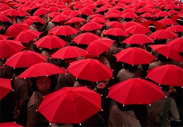
Red is great for products associated with action as it is the colour of energy.
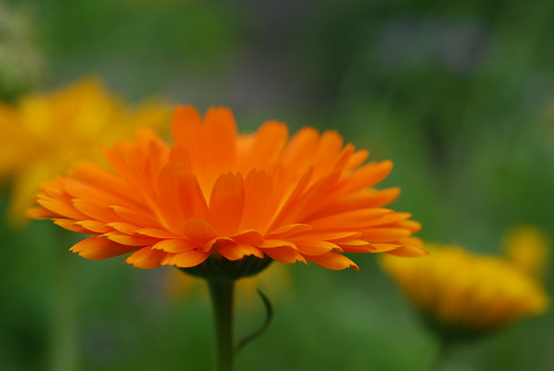
Orange- Being a blend of red and yellow, orange is a great compromise between the intensity and passion of red and the cheerfulness of yellow. As a result, orange conjures up feelings of strength, ambition, and fun.
The colour orange brings forth images of the sun, fire and flame, and flamboyance.
Green –We all know Green is associated with calm – just think about nature, lawns, and forests. The color Green is connected with good luck, fertility, and generosity. As well as envy. Whilst Dark Green is linked with growth, money, and masculinity.
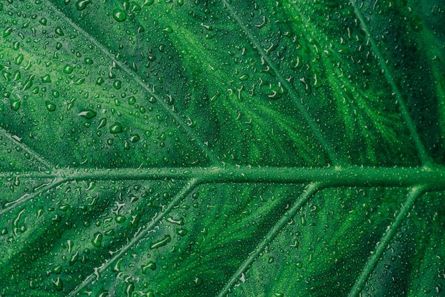
Being the traditional color of peace, harmony and support it can be used to great effect in increasing confidence and loyalty in branding.
Blue– Much of our natural world is made up of Blue – just think the sky and oceans – and as such, it is a universally loved color. As we all know it brings calm, what you may not know is why. Seeing the color Blue actually causes the release of calming chemicals in the brain.
A Light Blue color in a bedroom creates tranquillity and a relaxed impression while a strong Royal Blue can feel dark and foreboding. Too much blue can impart feelings of depression and coolness so use it wisely as overuse can leave consumers feeling aloof and unconnected with the product. Yet if used correctly Blue brings feelings of loyalty and dependability – the reason it is used so widely in uniforms.

Blue is the color of wisdom, reliability, and contemplation.
Purple- Purple is a culturally sensitive color with some people listing it as their favourite color and others disliking it almost to the point of revulsion. It can stimulate brain activity and thus can be used to great effect in advertising when used correctly.
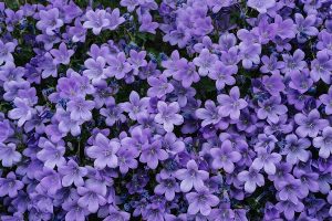
Traditionally a representative of royalty, Purple gives a feeling of sophistication and respect.
Do you know Cadbury’s actually owns the copyright to their color of purple? Code number #2865c Pantone is now owned by a Chocolate company. Read the news in more detail here…
Brown- Being the color of earth, brown links well with things of organic and natural states. It creates a feeling of stability and being grounded. It is the color most associated with friendship and reliability.
In some cultures, it can represent mourning so use it with care.
White-Neutral and conservative, white is the union of all colors in the spectrum. White is the standard color of Wedding Dresses, Christening Gowns, and Deb dresses – this is because it symbolises purity, innocence, truth, and even surrender. It is also neutral and conservative.
White can be used to accentuate the absence of color and as such emphasises clarity and simplicity in advertising. It is associated with health and cleanliness – think hospitals and lab coats – and safety and sanctuary – a lighthouse, and bright light in general.
Did you know it’s clinically proven if you wear a white lab coat you are 95% more trusted than if you wear a pair of jeans?
Black- Black is the most complex of all the colors as it is often associated with sophistication and affluence – such as a black tie affair, – is the most used color in everyone’s wardrobe (little black dress anyone?) and is also the color of funerals and grief. It is always a serious color and can make people seem more stylish and intelligent if used correctly.- oh and it’s slimming!
Due to its nature, it is an amazing contrasting color and is often used in design and photography websites to make images stand out. Yellow on Black is the most contrasting of all the two-tone combinations, so use this wisely and only when trying to create maximum impact.
It is always a serious color and can make people seem more stylish and intelligent if used correctly- oh and it’s slimming!
Conclusion- Everybody has a favourite color or theme, you may even have two or three. Think about why you are drawn to that color so much. Does it evoke memories of happy times, does it make you feel a certain way – motivated, strong, comfortable?
Color surrounds our daily lives.
Next time you are walking down the street, consciously observe the colors around you and how they affect your mood.
And remember just about every color you see down a High Street has been chosen by professional color psychologists, possibly wearing a white lab coat.