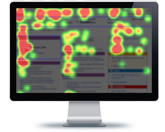

A heat map is a data visualisation tool that uses colour to highlight the areas of your web page that get the most attention from a user’s mouse. The colours range from cool to hot, which means when you look at your web page, the areas displaying the hottest colours are the areas where most visitors click or hover with their mouse.
How do heat maps work?
Heat Maps is a software tool that collects user data and displays the results over an image of the actual web page. The data is aggregated and allows the website owner to see the activity of every unique user, making it easy to see where your visitors are congregating, and which areas of your site are being ignored.
Is there more than one type of heat map?
Great question! Heat maps can be used to report on the origin of click-throughs, scrolling, and other user behaviours.
Original heat maps give you a visual representation of the areas of your site that get the most activity. It allows you to pinpoint hot and cold spots on your website.
Scroll heat maps show you how far your users scroll before they bounce. Boredom is the enemy of online retailers. High levels of bounce at certain points on your site indicate a need to reconsider the length and type of content you are using. A high bounce rate may also be related to usability issues or graphic elements that are not engaging viewers.
Confetti heat maps reveal usability issues. These maps are high-resolution and show individual clicks across the page. If users are clicking on non-clickable items and leaving in frustration, it shows they may be trying to access your product or service and failing. Using Confetti heat maps will help you change the layout and usability of your site to increase conversion rates.
When should I use a heat map?
Heat maps reveal user behaviour, therefore it’s sensible to have one going all of the time, and maintain a close eye on the data, of course. Monitoring data daily will help you tweak your site for an improved visitor experience. Analysing heat map data over 6-12 months will help you efficiently redesign the graphic and written content of your website, and capture more conversions in the process.
Heat maps can be used to identify:
- which headlines on your site are working
- distractions from your core content
- navigation issues
- how much content is being consumed (that is, not scrolled over)
- images that attract the most attention
- whether opt-in and call-to-action buttons are working
- where most of your users congregate on the page
- the best placement for content that converts your visitors to customers
- the different needs of different groups (e.g.: men vs women; visitors from different geographical locations, or age groups)
- the user experience, including interactions with images and text
So, what are you waiting for? Increase your conversions with heat map software by easily identifying problems on your website through targeted reporting of user behaviour. For a current list of the best heat map software available, click here.
If you would like to discuss heat maps or have issues with your website, please don’t hesitate to contact the team at We Push Buttons.
